
Zigzag card
A half-image, half-text block designed to be stacked — each successive card flips the image to the opposite side, which is where the name comes from. It is the only component in the system that ships with written content limits.
Anatomy
A 1320 px wrapper split roughly in half: a 656×492 image on one side, a text column on the other with 64 px of padding.
Text side
- Title — Title 3 in-container, 26/30 ExtraBold
- Body — Body 1, 16/20, in
Foreground/2 - Up to two actions — one primary, one secondary
The image is 656 of 1320 px — 49.7 %, not quite half — and holds a 4:3 ratio, the same frame the Images with overlay text component uses at Size=Extra, Grid=2.

Benefit from Free Ad Services as a VIP Customer
Want a boost in your business for free? Ronix offers free ad services to its VIP customers. This means you can receive content for your social media and website, and a design for your store and showroom, all in your desired language.
The 64 px text padding is component-specific —
zigzag-card/text-wrapper-padding/Extra — rather than a step on
the general padding scale. Use the token, not a hard-coded value.
Alternating direction
The component is meant to repeat. Each card flips the image to the opposite side so the eye tracks down the page in a zigzag rather than a straight column.
Direction is set by a Picture Position = Right | Left
property. In code it is a modifier class, applied to alternate cards — or better, by
the parent list with :nth-child(even), so it cannot be
forgotten halfway down a long list.
Below 992 px the split collapses and the image always sits above the text, so the alternation disappears. That is correct — a flipped stack on a phone reads as a mistake.
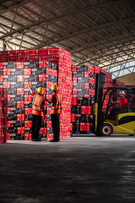
Warehouse in Germany
Located in the heart of Europe, serving as a central hub for European distribution.

Warehouse in China
Storing our products and facilitating quick access to the Asian market.
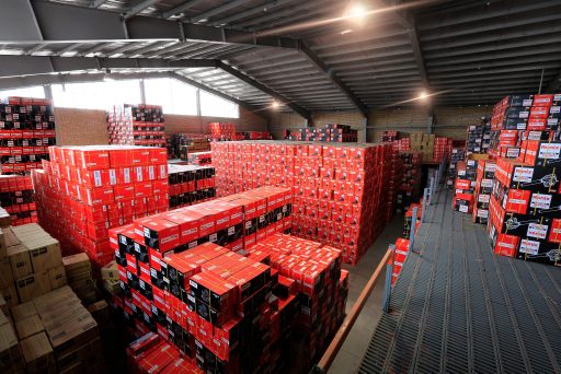
Warehouse in UAE
At the crossroads of Europe, Asia and Africa, serving the Middle Eastern market.
Content limits
The component carries explicit copy limits. Honour them: the 64 px padding leaves a narrow measure, and the card holds a fixed 492 px height at Extra.
Below the minimums the text column looks empty against the image; above the maximums it overflows, because the height does not grow at Extra.
| Field | Minimum | Maximum |
|---|---|---|
| Title | 48 characters | 132 characters |
| Description | 200 characters | 488 characters |
Zigzag Card - 1400-992.Accordion variant
Zigzag Card with Accordion-1 replaces the text column with
a panel of four collapsibles on background/2, plus a
“Back” control at the top right.
States
Ten variants: five State values crossed with
type of Extra or Default. State=Main is the plain card;
Accordion-1 through -4 each show a different item expanded.
That is a prototyping convention, not a code one. In markup this is one
component with native <details> elements — the five
states collapse into ordinary open/closed behaviour.
Free ad services
Showroom design
Social media content
Product training
Accordion headings are Subtitle 1 Stronger — 20 px
Bold 700 at a 100 % line height — and bodies are
Body 2 Strong at 14/18. Note the library labels every
heading in this component simply “Text”, so the real headings are not
specified anywhere.
Responsive behaviour
The card holds its two-column split down to 992 px, then stacks. Once stacked its height roughly doubles, because the text no longer has a column to fill.
| Breakpoint | Card | Layout |
|---|---|---|
| Large | 1320 × 492 | Side by side |
| 1140 × 425 | Side by side | |
| Medium | 960 × 480 | Side by side |
| 720 × 966 | Stacked | |
| Small | 540 × 655 | Stacked |
| 326 × 751 | Stacked |
Markup
Direction is a modifier on alternate cards. Applying it with
:nth-child(even) in the parent list is safer still.
<article class="rx-zigzag">
  <div class="rx-zigzag__media"><img src="vip.jpg" alt=""></div>
  <div class="rx-zigzag__body">
    <h2 class="rx-zigzag__title">Benefit from Free Ad Services</h2>
    <p class="rx-zigzag__text">Want a boost in your business…</p>
    <div class="rx-zigzag__actions">
      <a class="rx-btn rx-btn--primary" href="/download">Download</a>
    </div>
  </div>
</article>

<!-- The next card down flips the image -->
<article class="rx-zigzag rx-zigzag--flip">…</article>

/* Or let the list handle it */
.zigzag-list > .rx-zigzag:nth-child(even) .rx-zigzag__media { order: 2; }