
Images with overlay text
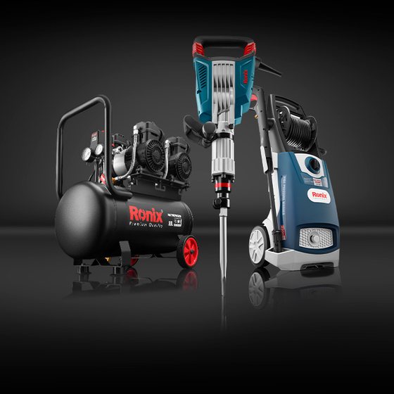
An editorial image block: a photograph, a gradient scrim, a Title 3 headline and an optional action. Unlike the category tile, this component brings its own scrim — so it is legible over any photograph.
Anatomy
Three layers: the photograph, a bottom-up gradient to black, and the content block at
Padding/Medium (16 px).
The gradient is attached to the content block rather than being a fixed slice of the frame. That matters: when the card narrows and the headline wraps to more lines, the scrim grows with it. A fixed-height scrim leaves the extra lines sitting on bare photograph.
Content
- Headline — Title 3 in-container, 26/30 ExtraBold, in
Foreground/On brand - Action — the standard secondary button, optional
Text is left-aligned and bottom-aligned, which is the opposite of the category tile. The two components sit on the same page types and do not agree.
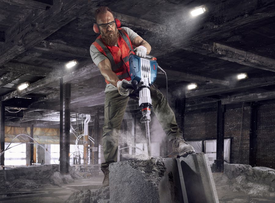
Size × Grid
Four variants from two properties, and this time the naming holds.
Size sets the height; Grid
sets how many fit across the container.
Because only the width changes with Grid, the 3-up variants are portrait while the 2-up variants are landscape — same height, narrower frame.
| Variant | Width token | Height token | Size | Aspect |
|---|---|---|---|---|
| Size=Extra, Grid=2 | Size-2 column/Extra-Width | Extra-Height | 656 × 492 | 1.33 landscape |
| Size=Default, Grid=2 | Size-2 column/Defualt-Width | Defualt-Height | 566 × 424 | 1.33 landscape |
| Size=Extra, Grid=3 | Size-3 column/Extra-Width | — reuses 2-column | 434 × 492 | 0.88 portrait |
| Size=Default, Grid=3 | Size-3 column/Defualt-Width | — reuses 2-column | 374 × 424 | 0.88 portrait |
The scrim
A bottom-up gradient to solid black, sized to the content it sits behind. It is part of the component, not the photograph.
This is what makes the component robust: the headline stays legible whether the underlying image is a dark workshop or a bright outdoor shot.
Compare with the category tile
The category tile has no scrim, and depends on every photograph being dark in the lower band. The system therefore contains both the problem and its solution, on two components used on the same kinds of page.
Grids and rails
Two or three across the container at Large and Medium, with an 8 px gap. At Small the images go full width and the row becomes a horizontal rail.
The page also holds a four-up rail with a pair of 40×40 chevrons at its lower-right — larger than the 30×30 chevrons on the PDP slider.
| Breakpoint | Container | Grid=2 | Grid=3 |
|---|---|---|---|
| Large | 1320 | 2 × 656 | 3 × 434 |
| 1140 | 2 × 566 | 3 × 374 | |
| Medium | 960 | 2 × 476 | 3 × 314 |
| 720 | 2 × 356 | 3 × 234 | |
| Small | 540 | 1 × 540 | 1 × 540 |
| 326 | 1 × 326 | 1 × 326 |
(C − 8) / 2 and (C − 16) / 3. Widths are fixed per breakpoint in the library, but they all follow that rule.
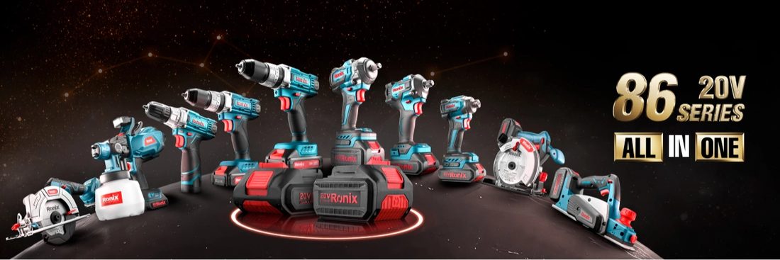
Overlay card with description
The page’s wrapper carousels use a second overlay
variant: same photograph-and-scrim construction, but the content is a headline
and a descriptive paragraph, with no action.
The frame is 435×462 — slightly portrait — and four sit across a 1320 px container with the paging chevrons placed beneath, right-aligned.
Type
- Headline —
Web/Title/Title 3, 24/32 Bold 700 - Body —
Web/Body/Body 2, 14/20 Regular - Both in
Generic/Foreground/On brand(#ffffff)
Padding is Padding/X-Large (24 px).

Job category card
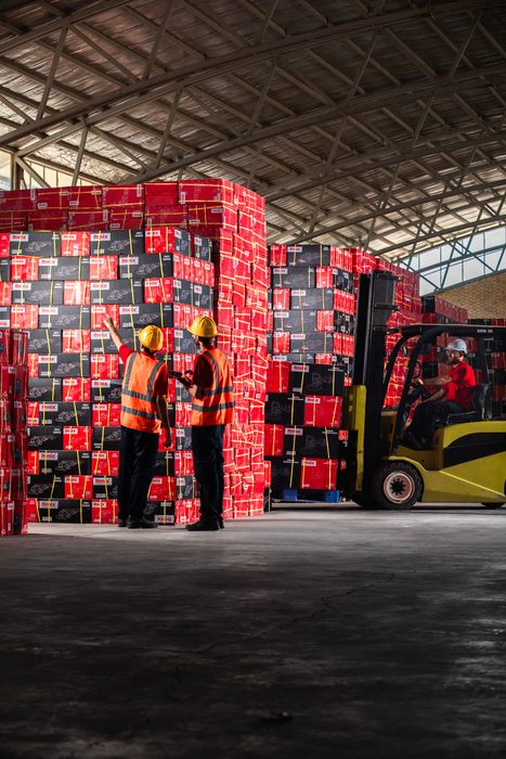
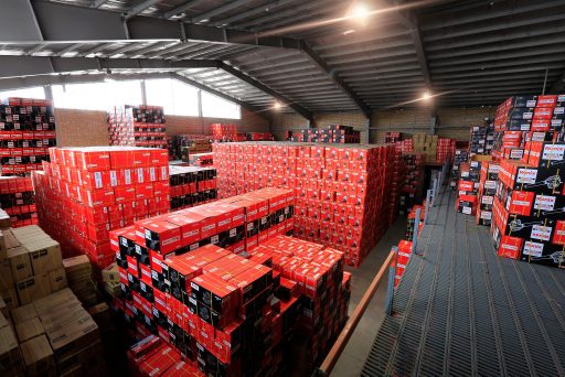
A separate carousel component: a 435×245 photograph with a dark band across the foot carrying a 48×48 icon and a Title 4 label.
Sixteen cards ship — Concrete, Machine, Wood Carving, Painting, Gardening, Masonry, Blacksmith, Glazing, Industrial, Tool Set, Machinist, Electrical, DIY, Wood Working, Jewelry and Automotive tools.
Each carries a distinct line icon drawn for that trade.
Markup
The scrim is a pseudo-element, so the markup carries only the photograph and the content.
<a class="rx-overlay-image" href="/brushless">
  <img src="brushless.jpg" alt="">
  <span class="rx-overlay-image__content">
    <span class="rx-overlay-image__title">Brushless Motors; The Way Forward</span>
    <span class="rx-btn rx-btn--secondary">Brushless motor</span>
  </span>
</a>

<!-- Three across -->
<div class="rx-image-grid rx-image-grid--3">
  <a class="rx-overlay-image rx-overlay-image--grid3">…</a>
</div>