
Product card
The densest component in the system and the one that appears most often. It carries a product image, SKU, status labels, title, a three-line specification list, a rating and a compare control — inside 221 px at its narrowest.
Anatomy
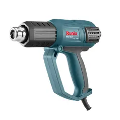
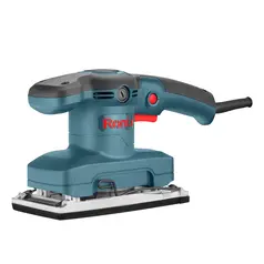
Two regions. The media area is a 1:1 square on
background/3 (#f0f0f0) holding a cut-out product
photograph. The body sits on background/1
with Padding/Small (12 px).
Body order, top to bottom
- SKU in Caption 1 Strong (12 px), with status labels right-aligned
- Title in Body 1 Strong — Medium 500, 16/22
- Specification list in Body 3 — 12/16, three items
- Rating and Compare, pushed to the foot
Internal gaps are Padding/XXX-Small (4 px); the gap
between labels is Padding/XXXX-Small (2 px).
States and variants
The component set is a 2×2 matrix: State of Rest or
Hover, crossed with Type of Extra or Defualt.
Hover does two things — it draws a 1 px
Brand/Stroke/1 border around the whole card, and it lifts
the body to background/1/Hover (#f5f5f5). The media area
does not change.
There is no pressed or focus variant in the library. For keyboard users the hover
treatment should be mirrored on :focus-visible.
| Variant | Min width | Border | Body fill |
|---|---|---|---|
| State=Rest, Type=Extra | 257 px | transparent | #ffffff |
| State=Hover, Type=Extra | 257 px | #a30000 | #f5f5f5 |
| State=Rest, Type=Defualt | 221 px | transparent | #ffffff |
| State=Hover, Type=Defualt | 221 px | #a30000 | #f5f5f5 |
Status labels
Four states ship in the library: New, Hot Sale, Discontinued and Made in Germany, the last carrying a flag glyph.
Labels are 22 px tall, Caption 2 (10/12), with a 2 px radius — the only
place in the system that uses Corner radious/2 rather than 4.
Two labels on one card is the practical maximum at Type=Defualt; past that they wrap and push the title down.
Grid and responsive behaviour
Cards sit inside the standard container and step down in count rather than in width.
The gap is always Padding/X-Small (8 px).
Below, the live grid follows the same rules — narrow the window and it steps 5 → 4 → 2.
Min width is not a grid constraint
The min width tokens (257 and 221) describe the card used
standalone or in a rail. They do not apply inside the grid — the library’s
own layouts take cards down to 180 px and 163 px.
Applying min-width to a grid child makes it overflow its
column and paint over its neighbour, which silently swallows the hover border on the
overlapped edge. Grid cards must be free to shrink.
| Breakpoint | Section | Container | Columns | Card width |
|---|---|---|---|---|
| Large | 1400 | 1320 | 5 | 264 |
| 1200 | 1140 | 5 | 228 | |
| Medium | 992 | 960 | 4 | 240 |
| 768 | 720 | 4 | 180 | |
| Small | 576 | 540 | 2 | 270 |
| 358 | 326 | 2 | 163 |
Live grid
Grid or rail?
The library contains a second set of sections where five cards keep their minimum width inside a 326 px container — a total of 1145 px of content in a 326 px frame.
That is not a broken layout; it is a horizontally scrolling rail. Both patterns are legitimate, and they are visually identical until the viewport narrows, so the choice has to be made explicitly in code.
PLP card
A category tile, 242×140, with two states — default and hover. It carries an image and a single centred label, nothing else.
Hover draws a dark border rather than the brand red used on the product card.
| Legacy variable | Value |
|---|---|
| Back Ground / White - Container | #ffffff |
| Back Ground / Light Gray - Base | #f2f2f2 |
| Back Ground / Secondary | #e5e5e5 |
| Red / Dark Red | #bf0000 |
| >358 / Subtitle / Subtitle small | 14 / 20 Regular |
Markup
The whole card is one anchor, so the entire surface is the target rather than the title
alone. Compare is a nested control and needs its own handler with
preventDefault.
<!-- In a grid: no width modifier, let the column size it -->
<a class="rx-product-card" href="/p/V10200">
<span class="rx-product-card__media"><img src="…" alt=""></span>
<span class="rx-product-card__body">
<span class="rx-product-card__meta">
<span class="rx-product-card__sku">V10200</span>
<span class="rx-product-card__labels">
<span class="rx-label">Hot sale</span>
</span>
</span>
<span class="rx-product-card__title">Heat Gun 2000W</span>
<ul class="rx-product-card__specs">
<li>Power 2000W</li>
<li>2 speed settings</li>
<li>50-600 °C</li>
</ul>
<span class="rx-product-card__footer">
<span class="rx-rating" aria-label="Rated 4 out of 5">★★★★☆</span>
<span class="rx-compare">Compare</span>
</span>
</span>
</a>