
Category tile
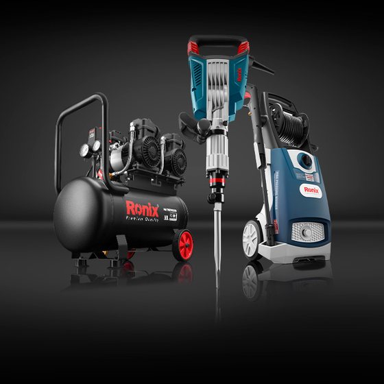
The simplest component in the system: a full-bleed product photograph with a category name set directly on it. No plate, no scrim, no border. It carries the whole category grid.
Anatomy
Two elements. A photograph that covers the tile completely, and a label centred along the
foot of the tile, Padding/Medium (16 px) up from the
bottom edge.
The label is Title 5 in-container — 18/22 ExtraBold — in
Foreground/On brand (#ffffff), set in caps.
No scrim
The label sits straight on the image. It works here only because every category photograph in the set is shot on the same dark graduated background, with the product centred and the lower band of the frame deliberately kept clear.
That is a content contract, not a component feature — and the component does nothing to enforce it.
The Type × Size matrix
Six variants ship, crossing Type of Large, Medium or Small
with Size of Extra or Default.
The properties do not behave as their names suggest. Read the table before assuming which variant you want.
| Variant | Size | Aspect | Shape |
|---|---|---|---|
| Type=Large, Size=Extra | 257 × 256 | 1.00 : 1 | Square |
| Type=Large, Size=Default | 221 × 220 | 1.00 : 1 | Square |
| Type=Medium, Size=Extra | 186 × 186 | 1.00 : 1 | Square |
| Type=Medium, Size=Default | 356 × 199 | 1.79 : 1 | Wide |
| Type=Small, Size=Extra | 266 × 149 | 1.79 : 1 | Wide |
| Type=Small, Size=Default | 159 × 160 | 1.00 : 1 | Square |
All six, to scale
Category grid
Tiles are laid out ten at a time — five across, two rows — with an
Padding/X-Small (8 px) gap. Below 768 px the grid
drops to two columns and the block runs to five rows.
The label stays 18 px at every breakpoint. On the 159 px Small tile that is a large word on a small picture, and longer names — Cordless tools, Tools accessories — wrap onto two lines. The wrapped block stays centred and stays pinned to the foot, so the tiles in a row still align.
| Breakpoint | Section | Container | Columns | Tile | Gap |
|---|---|---|---|---|---|
| Large | 1400 | 1320 | 5 | 257 × 256 | 8 |
| 1200 | 1140 | 5 | 221 × 220 | 8 | |
| Medium | 992 | 960 | 5 | 186 × 186 | 6.8 |
| 768 | 720 | 2 | 356 × 199 | 8 | |
| Small | 576 | 540 | 2 | 266 × 149 | 8 |
| 358 | 326 | 2 | 159 × 160 | 6.8 |
Live grid
Narrow the window and it steps from five columns to two.
aspect-ratio.Content rules
Because there is no scrim, the photograph has to do the work. Two rules follow, and neither is enforced by the component.
Name length
A third rule applies to the copy. The label holds 18 px at every breakpoint while the tile shrinks to 159 px, so a name must either be short or contain a space to wrap on — Tools accessories wraps cleanly onto two lines, Accessories alone cannot and will overhang the tile.
The label wraps at spaces only. Breaking mid-word would be worse than the overhang, so this is a constraint on category naming rather than something CSS should paper over.
Where category photography cannot be guaranteed dark across the lower band, apply a scrim: a bottom-up gradient to 30 % black, matching the treatment for placement on images.
Markup
The tile is one anchor. The label is decorative text over the image, so the anchor
carries the accessible name and the alt stays empty.
<a class="rx-category" href="/c/power-tools">
  <img src="power-tools.jpg" alt="">
  <span class="rx-category__label">Power tools</span>
</a>

<!-- In a grid -->
<div class="rx-category-grid">…</div>

<!-- Wide variant -->
<a class="rx-category rx-category--medium-default" href="…">…</a>