
Modal & catalogue card
A profile modal shown over a darkened page, and the catalogue card it links to, with rules governing which of the card’s parts are optional.
Modal card
A profile modal: image on one side, name, role, biography and two actions on the other, with a close control at the top right.
Layout by breakpoint
- Default and 992 — side by side, image left
- 768 and 576 — stacked, image on top
- 358 — stacked, and the two actions go full width, one above the other
The scrim behind it is the 90 % black specified in the UI introduction — one of the few places where a rule stated in the introduction is actually followed by a component.
R. Ramkhoo
Founder and CEO
With more than 20 years of experience and expertise in the development of various tool categories, R. Ramkhoo is in charge of overseeing R&D and technological strategies in Ronix. He is directly responsible for supervising all phases of quality control, standard setting, and customer needs analysis.
Breakpoints
Seven columns are laid out on the page — 1920, 1400, 1200, 992, 768, 576 and 358 — but the component itself has five named variants. 1920, 1400 and 1200 all use the Default layout.
| Variant | Layout | Actions | Title over image |
|---|---|---|---|
| Default | Side by side | Inline pair | No |
| 992 | Side by side | Inline pair | No |
| 768 | Stacked | Inline pair | No |
| 576 | Stacked | Inline pair | No |
| 358 | Stacked | Full width, stacked | Yes |
Catalogue card
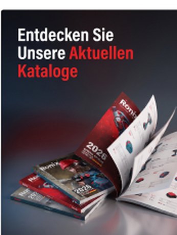
A portrait cover image with a title beneath, and optionally a description row with a disclosure chevron and a download button. Two sizes: Default and Small.
The title is part of the artwork
“Entdecken Sie Unsere Aktuellen Kataloge” is baked into the cover image, not a text layer — it scales with the image between Default and Small rather than holding a fixed size.
Localising the cover therefore means supplying new artwork, not changing a component property.
Optional parts
Three rules govern which parts may be omitted, in the same way as the clickable card.
| # | Rule |
|---|---|
| 1 | A button is added to this component; it may or may not be present. |
| 2 | The description is optional; if there is no description, do not render the row at all. |
| 3 | If the description runs longer, it wraps to two lines and the chevron centres against the block. |
Rule 2 is the one to get right: omit the row, do not render it empty. An empty description row leaves a gap and a chevron pointing at nothing. Rule 3 is why the chevron is vertically centred against the description rather than pinned to its first line.
Every permitted combination
Only the cover and the title are required. The six cards below are the combinations drawn in the library.
Markup
A real modal needs <dialog> — it gives focus
trapping, Escape to close and inertness of the page behind, none of which the library
specifies but all of which a modal requires.
<dialog class="rx-modal" aria-labelledby="modal-name">
  <button class="rx-modal__close" aria-label="Close">…</button>
  <div class="rx-modal__media"><img src="portrait.jpg" alt=""></div>
  <div class="rx-modal__body">
    <h2 class="rx-modal__name" id="modal-name">R. Ramkhoo</h2>
    <p class="rx-modal__role">Founder and CEO</p>
    <p class="rx-modal__text">…</p>
  </div>
</dialog>

<!-- Catalogue card: omit the row entirely when there is no description -->
<a class="rx-catalogue" href="/catalogues/general">
  <span class="rx-catalogue__media"><img src="cover.jpg" alt=""></span>
  <span class="rx-catalogue__title">General catalogue</span>
  <!-- no empty row, no orphan chevron -->
  <span class="rx-catalogue__action">Download</span>
</a>